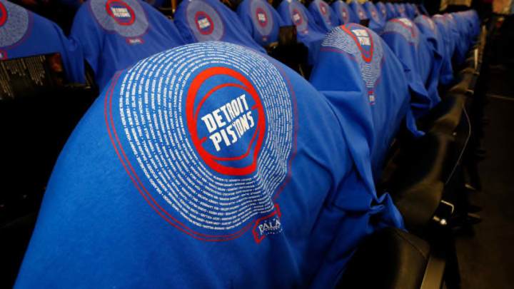
On Friday, Nike held a showcase event to reveal all the Statement Edition uniforms for the Detroit Pistons and the rest of the NBA.
When Nike became the official brand of NBA uniforms this summer changes were obviously going to follow. It started by ditching the sleeved look that Adidas ushered in, and it also led to some strong uniform rebrands by a few teams.
The Detroit Pistons unveiled their jerseys a few weeks back and the only real noticeable change was the new naming. Traditional home white uniforms are now called “Association” while the away colored uniforms have become “Icon.” But it’s been known for awhile now that at least two more jerseys would be coming out for the Pistons in this Nike era.
The two variations that Nike is taking on are the “Statement” Detroit Chrome and “Pride” Motor City uniforms. Nike held an event in Los Angeles on Friday night where they released every team’s statement design. So, it’s time to grade these from a fashion standpoint.
The full look.
— Detroit Pistons (@DetroitPistons) September 16, 2017
See all the new jerseys for this season at https://t.co/kgnN6cTzg7 pic.twitter.com/GdBsuHYeKY
First thing’s first, I was iffy on the Chrome jerseys when they were first announced in 2015. But over time I grew to like them more and more. However, this change to them does not sit well with me. The addition of red and keeping the Pistons’ normal blue on them clashes too much. I keep looking at these uniforms and begin to get a little headache. Red lettering with a blue outline would probably pop a lot more, and save my eyes from the strain.
I get that they wanted to keep the Pistons red and blue incorporated in this, but now I’m mad at myself for not liking the original Chrome jerseys at one point. Maybe these will do the same and grow on me over time. But I find that even less likely because the Pistons are only wearing these five times this season. That’s not enough game footage for me to fall in love with them. They would have to win every one of those games on a last-second shot for me to even consider it.
Of the three jerseys out right now these are my least favorite. However, that doesn’t mean I don’t have faith in the Motor City uniforms. Since the first promo of Greg Monroe in one, I’ve been hooked. I think the navy blue looks cool and having the words Motor City across the chest is iconic. Honestly, in my perfect world, those become the Pistons’ new “Icon” uniforms and they just wear them every game.
Next: Pistons bold predictions for 2017-18 season
So what do you think of these new Chrome uniforms? Do you think they’re better than the old ones? Better yet, do you wish that Nike brought back the all red ones from the Rasheed days?
